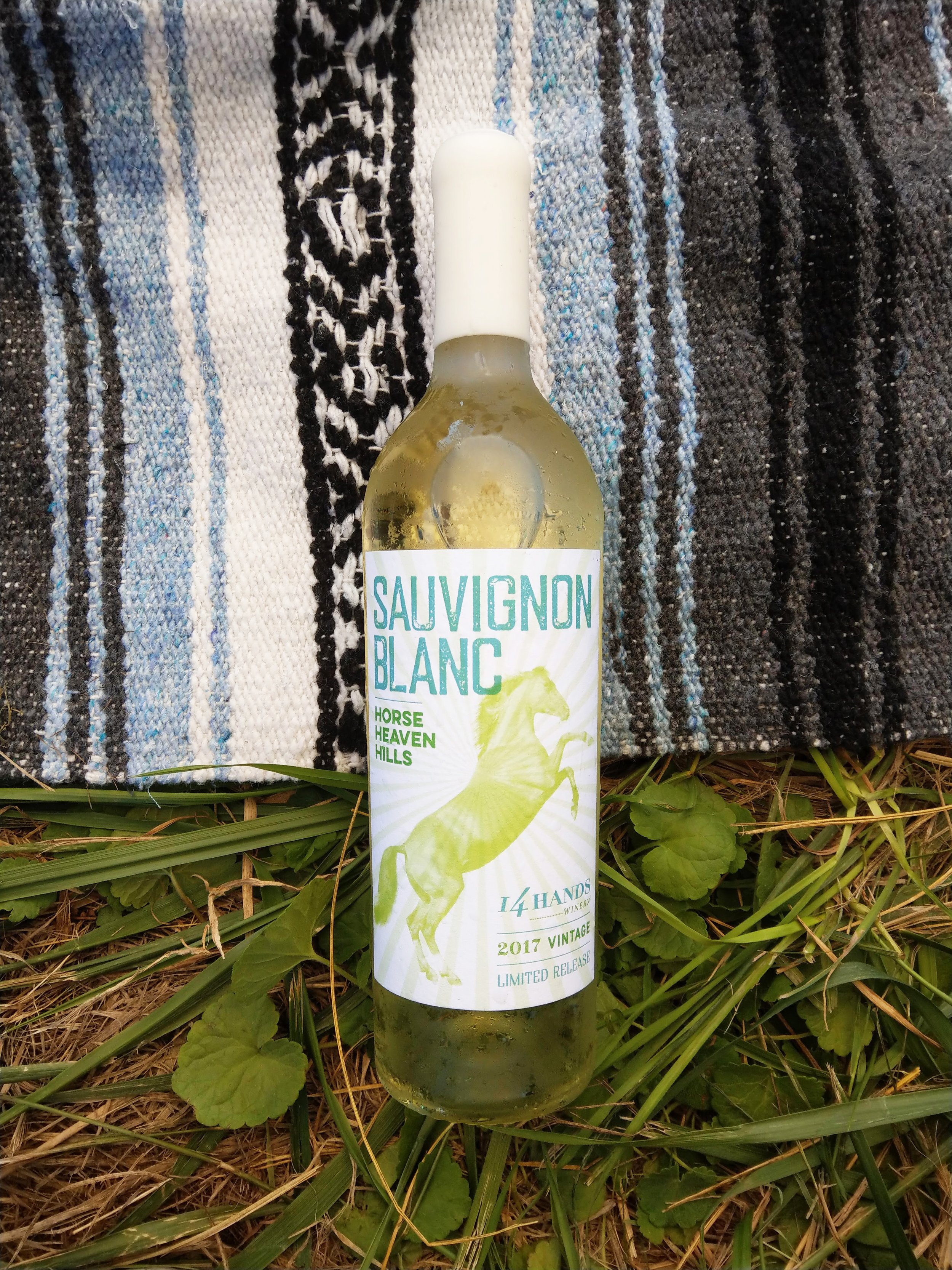
14 Hands Seasonal Labels
Package design, art direction.
14 Hands is a winery in Eastern Washington, whose name is based on the hand-height of the wild horses in the area. Every year, they release a special series of seasonal wines for their club members. As the wines are a different collection every year, they ask for a unique suite of labels to commemorate these releases. For this particular year, I was inspired by the posters of Hatch Show Print. The play of bold typography and bright hues fit perfectly with the bold, playful and art-forward brand aesthetic, and the overlapping colors harkened back to the process of silkscreening, giving the labels a slightly rough, handmade feel. I designed each label as a standalone piece, but created a suite of elements that linked the labels together: a limited and individual color palette, different horse photography, a geometric pattern, and distinctly styled but slightly different information lockup for each version. The end result was a series of fun, distinctive, but still on-brand labels (and personally, one of my favorite projects).


